Explore Stylish Designs A CSS Page Showcase Journey
Elevate your web design with our CSS styles. Explore responsive layouts, beautiful typography, and modern visual enhancements effortlessly.
Dear learners, Are you interested in assessing your progress?
Request your mentor to give you access and start your Test.
“Dive into the world of web design with our beginner-friendly CSS course. Learn the fundamentals of styling, layout, and responsiveness. Build a solid foundation for creating visually appealing and modern websites. Start your coding journey today!”
Learn CSS Intermediate level Styles
1. CSS Pseudo Element :
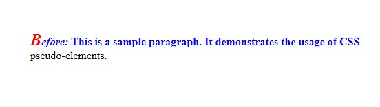
p::first-line:- Selects and styles the first line of the paragraph.
- In this example, it changes the color to blue and sets the font weight to bold.
p::first-letter:- Selects and styles the first letter of the paragraph.
- In this example, it increases the font size to 1.5em and changes the color to red.
p::before:- Inserts content before the content of the paragraph.
- In this example, it adds the text “Before: ” with italic font style.
HTML

<!DOCTYPE html>
<html lang="en">
<head>
  <meta charset="UTF-8">
  <meta name="viewport" content="width=device-width, initial-scale=1.0">
  <style>
    /* Style for the first line of the paragraph */
    p::first-line {
      color: blue;
      font-weight: bold;
    }

    /* Style for the first letter of the paragraph */
    p::first-letter {
      font-size: 1.5em;
      color: red;
    }

    /* Style for content before the paragraph */
    p::before {
      content: "Before: ";
      font-style: italic;
    }
  </style>
  <title>CSS Pseudo-elements Example</title>
</head>
<body>

  <!-- HTML content with a paragraph -->
  <p>This is a sample paragraph. It demonstrates the usage of CSS pseudo-elements.</p>

</body>
</html>
HTML
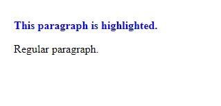
2.CSS combinations :
HTML
<!DOCTYPE html>
<html lang="en">
<head>
  <meta charset="UTF-8">
  <meta name="viewport" content="width=device-width, initial-scale=1.0">
  <style>
    /* Style all paragraphs with the class "highlight" */
    p.highlight {
      color: blue;
      font-weight: bold;
    }
  </style>
  <title>CSS Combinations Example</title>
</head>
<body>

  <!-- Apply the "highlight" class to this paragraph -->
  <p class="highlight">This paragraph is highlighted.</p>

  <!-- This paragraph will not be affected by the styles -->
  <p>Regular paragraph.</p>

</body>
</html>
HTML
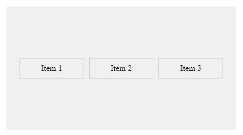
3. CSS Flex :
The
.flex-containerclass applies the flexbox styles to the container:display: flex;: Activates the flexbox layout for the container.justify-content: space-between;: Distributes items evenly along the main axis, leaving space between them.align-items: center;: Centers items along the cross axis.height: 200px;: Sets a fixed height for the container (for demonstration purposes).background-color,padding: Adds styling for better visualization.
The
.flex-itemclass styles individual flex items:flex: 1;: Allows items to grow and shrink equally based on available space.padding,border,margin: Adds spacing and borders to each item.text-align: center;: Centers the text within each item.
HTML
<!DOCTYPE html>
<html lang="en">
<head>
  <meta charset="UTF-8">
  <meta name="viewport" content="width=device-width, initial-scale=1.0">
  <style>
    /* Apply flexbox styles to the container */
    .flex-container {
      display: flex;
      justify-content: space-between; /* Distribute items evenly along the main axis */
      align-items: center; /* Center items along the cross axis */
      height: 200px; /* Set a fixed height for demonstration purposes */
      background-color: #f0f0f0;
      padding: 20px;
    }

    /* Style individual flex items */
    .flex-item {
      flex: 1; /* Grow and shrink equally based on available space */
      padding: 10px;
      border: 1px solid #ccc;
      margin: 5px;
      text-align: center;
    }
  </style>
  <title>CSS Flex Property Example</title>
</head>
<body>

  <!-- Flex container with three flex items -->
  <div class="flex-container">
    <div class="flex-item">Item 1</div>
    <div class="flex-item">Item 2</div>
    <div class="flex-item">Item 3</div>
  </div>

</body>
</html>
HTML
-
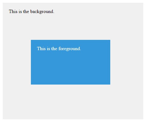
- The
.backgroundclass represents the background element:position: absolute;: Positions the element relative to the nearest positioned ancestor.top: 0; left: 0;: Aligns the element to the top-left corner of its containing element (in this case, the entire viewport).width: 100%; height: 100%;: Sets the element’s width and height to cover the entire viewport.background-color: #f0f0f0;: Background color for the background element.z-index: 1;: Sets a lower stacking order compared to the foreground element.
- The
.foregroundclass represents the foreground element:position: absolute;: Positions the element relative to the nearest positioned ancestor.top: 50px; left: 50px;: Positions the element 50 pixels from the top and left of its containing element.width: 200px; height: 100px;: Sets the element’s width and height.background-color: #3498db;: Background color for the foreground element.z-index: 2;: Sets a higher stacking order compared to the background element.color: #fff; padding: 20px;: Text color and padding for better visibility.
- The
HTML
<!DOCTYPE html>
<html lang="en">
<head>
  <meta charset="UTF-8">
  <meta name="viewport" content="width=device-width, initial-scale=1.0">
  <style>
    /* Style for the background element */
    .background {
      position: absolute;
      top: 0;
      left: 0;
      width: 100%;
      height: 100%;
      background-color: #f0f0f0;
      z-index: 1; /* Lower z-index value */
    }

    /* Style for the foreground element */
    .foreground {
      position: absolute;
      top: 50px;
      left: 50px;
      width: 200px;
      height: 100px;
      background-color: #3498db;
      z-index: 2; /* Higher z-index value */
      color: #fff;
      padding: 20px;
    }
  </style>
  <title>CSS z-index Property Example</title>
</head>
<body>

  <!-- Background element -->
  <div class="background">
    This is the background.
  </div>

  <!-- Foreground element with a higher z-index -->
  <div class="foreground">
    This is the foreground.
  </div>

</body>
</html>
HTML
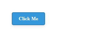
2. CSS Shadow Effect and Button property :
The
.buttonclass represents the button styles:display: inline-block;: Allows the button to be displayed as a block while maintaining inline behavior.padding: 10px 20px;: Sets padding inside the button.font-size: 16px; font-weight: bold;: Defines the font size and weight.text-align: center; text-decoration: none;: Centers the text and removes underlines for links.background-color: #3498db; color: #fff;: Background color and text color for the button.border: 2px solid #2980b9;: Adds a border to the button.border-radius: 5px;: Applies rounded corners to the button.cursor: pointer;: Changes the cursor to a pointer on hover.box-shadow: 0 4px 8px rgba(0, 0, 0, 0.1);: Adds a subtle shadow effect.transition: background-color 0.3s, transform 0.3s;: Applies a smooth transition to background color and transform properties.
The
.button:hoverselector defines the styles applied on hover:background-color: #2980b9;: Changes the background color on hover.transform: scale(1.05);: Scales the button to 105% of its original size on hover, creating a zoom-in effect.
HTML
<!DOCTYPE html>
<html lang="en">
<head>
  <meta charset="UTF-8">
  <meta name="viewport" content="width=device-width, initial-scale=1.0">
  <style>
    /* Button styles */
    .button {
      display: inline-block;
      padding: 10px 20px;
      font-size: 16px;
      font-weight: bold;
      text-align: center;
      text-decoration: none;
      background-color: #3498db;
      color: #fff;
      border: 2px solid #2980b9;
      border-radius: 5px;
      cursor: pointer;
      box-shadow: 0 4px 8px rgba(0, 0, 0, 0.1); /* Shadow effect */
      transition: background-color 0.3s, transform 0.3s;
    }

    /* Hover effect */
    .button:hover {
      background-color: #2980b9;
      transform: scale(1.05); /* Increase size on hover */
    }
  </style>
  <title>CSS Button with Shadow Effect</title>
</head>
<body>

  <!-- Button with shadow effect -->
  <a href="#" class="button">Click Me</a>

</body>
</html>
HTML
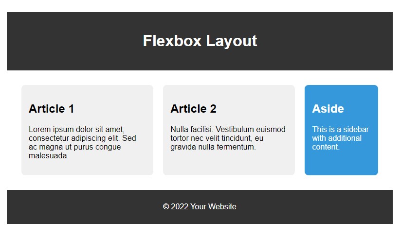
3. Advance CSS layout with Flexbox :
Header:
- Styled with a dark background, light text, padding, and centered content.
Main Section:
display: flex;: Activates flexbox layout for the main section.flex-wrap: wrap;: Allows items to wrap onto the next line.justify-content: space-between;: Distributes items evenly with space between them.
Article:
flex: 2;: Takes up two-thirds of the available space.- Styled with a light background, margin, padding, and rounded corners.
Aside:
flex: 1;: Takes up one-third of the available space.- Styled with a different background color, light text, margin, padding, and rounded corners.
Footer:
- Styled similarly to the header with a dark background, light text, padding, and centered content.
HTML
<!DOCTYPE html>
<html lang="en">
<head>
  <meta charset="UTF-8">
  <meta name="viewport" content="width=device-width, initial-scale=1.0">
  <style>
    body {
      margin: 0;
      font-family: 'Arial', sans-serif;
    }

    header {
      background-color: #333;
      color: #fff;
      padding: 20px;
      text-align: center;
    }

    main {
      display: flex;
      flex-wrap: wrap;
      justify-content: space-between;
      padding: 20px;
    }

    article {
      flex: 2;
      background-color: #f0f0f0;
      margin: 10px;
      padding: 15px;
      border-radius: 8px;
    }

    aside {
      flex: 1;
      background-color: #3498db;
      color: #fff;
      margin: 10px;
      padding: 15px;
      border-radius: 8px;
    }

    footer {
      background-color: #333;
      color: #fff;
      padding: 10px;
      text-align: center;
    }
  </style>
  <title>Advanced CSS Layout with Flexbox</title>
</head>
<body>

  <header>
    <h1>Flexbox Layout</h1>
  </header>

  <main>
    <article>
      <h2>Article 1</h2>
      <p>Lorem ipsum dolor sit amet, consectetur adipiscing elit. Sed ac magna ut purus congue malesuada.</p>
    </article>

    <article>
      <h2>Article 2</h2>
      <p>Nulla facilisi. Vestibulum euismod tortor nec velit tincidunt, eu gravida nulla fermentum.</p>
    </article>

    <aside>
      <h2>Aside</h2>
      <p>This is a sidebar with additional content.</p>
    </aside>
  </main>

  <footer>
    <p>© 2022 Your Website</p>
  </footer>

</body>
</html>
HTML
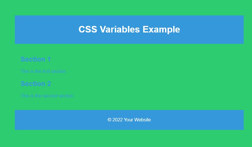
CSS variables :
:rootis used to define global CSS variables. These variables are then used throughout the stylesheet.--primary-color,--secondary-color, and--font-sizeare examples of CSS variables defined in the:rootselector. You can reuse these variables throughout your stylesheet.In the
bodyrule, the background color and text color are set using the CSS variables. This promotes consistency and makes it easy to update the color scheme.The
font-sizevariable is used for the base font size of the document.The
header,main,section, andfooterelements use CSS variables for styling, providing a consistent look and feel.
HTML
<!DOCTYPE html>
<html lang="en">
<head>
  <meta charset="UTF-8">
  <meta name="viewport" content="width=device-width, initial-scale=1.0">
  <style>
    :root {
      --primary-color: #3498db;
      --secondary-color: #2ecc71;
      --font-size: 16px;
    }

    body {
      font-family: 'Arial', sans-serif;
      font-size: var(--font-size);
      background-color: var(--secondary-color);
      color: var(--primary-color);
      margin: 0;
      padding: 20px;
    }

    header {
      background-color: var(--primary-color);
      color: #fff;
      padding: 10px;
      text-align: center;
    }

    main {
      padding: 20px;
    }

    section {
      margin-bottom: 20px;
    }

    footer {
      background-color: var(--primary-color);
      color: #fff;
      padding: 10px;
      text-align: center;
    }
  </style>
  <title>CSS Variables in HTML</title>
</head>
<body>

  <header>
    <h1>CSS Variables Example</h1>
  </header>

  <main>
    <section>
      <h2>Section 1</h2>
      <p>This is the first section.</p>
    </section>

    <section>
      <h2>Section 2</h2>
      <p>This is the second section.</p>
    </section>
  </main>

  <footer>
    <p>© 2022 Your Website</p>
  </footer>

</body>
</html>
HTML
Dear learners, Are you interested in assessing your progress?
Request your mentor to give you access and start your test.