Explore Stylish Designs A CSS Page Showcase Journey

Elevate your web design with our CSS styles. Explore responsive layouts, beautiful typography, and modern visual enhancements effortlessly.

Start Your Test Now
Dear learners, Are you interested in assessing your progress?
Request your mentor to give you access and start your test.

“Dive into the world of web design with our beginner-friendly CSS course. Learn the fundamentals of styling, layout, and responsiveness. Build a solid foundation for creating visually appealing and modern websites. Start your coding journey today!”

Learn Expert level CSS Styles

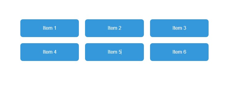
1. CSS  Grid Layout   :

Grid Columns: The grid-template-columns property is used to define the columns of the grid. In this example, it creates three equal-width columns using repeat(3, 1fr).

Grid Gap: The grid-gap property sets the spacing between grid items. In this case, it’s set to 20px.

Grid Items: Each grid item is represented by the .item class. It has styles for background color, text color, padding, text alignment, and border-radius to create a visually appealing layout.


HTML

<!DOCTYPE html>
<html lang="en">
<head>
  <meta charset="UTF-8">
  <meta name="viewport" content="width=device-width, initial-scale=1.0">
  <style>
    body {
      font-family: 'Arial', sans-serif;
      margin: 0;
      padding: 20px;
    }

    .container {
      display: grid;
      grid-template-columns: repeat(3, 1fr); /* Three equal-width columns */
      grid-gap: 20px; /* Spacing between grid items */
    }

    .item {
      background-color: #3498db;
      color: #fff;
      padding: 20px;
      text-align: center;
      border-radius: 8px;
    }
  </style>
  <title>CSS Grid Layout Example</title>
</head>
<body>

  <div class="container">
    <div class="item">Item 1</div>
    <div class="item">Item 2</div>
    <div class="item">Item 3</div>
    <div class="item">Item 4</div>
    <div class="item">Item 5</div>
    <div class="item">Item 6</div>
  </div>

</body>
</html>

HTML

2.CSS All Functions   :

  1. Color Functions:
    • rgb(240, 240, 240): Defines a color using RGB values.
    • `hsl(200, 50%, 20%))`: Defines a color using HSL values.
  • rgba(52, 152, 219, 0.7): Defines a color with an alpha (transparency) value.
  • darken(#3498db, 10%): Darkens a color by a specified percentage.
  1. Calc Function:

    • calc(100% - 40px): Performs a calculation to determine the width.
  2. Min and Max Functions:

    • max(1200px, 90%): Returns the maximum value between the specified values.
    • min(1200px, 90%): Returns the minimum value between the specified values.
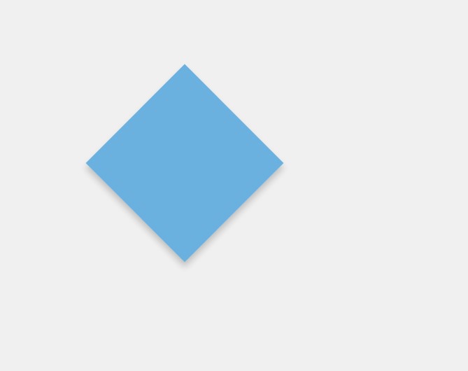
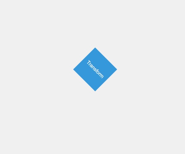
  3. Transform Function:

    • rotate(45deg): Rotates the element by 45 degrees.
  4. Transition Function:

    • transition: transform 0.3s ease-in-out;: Applies a smooth transition effect to the transform property over 0.3 seconds with ease-in-out timing function.
  5. Hover Effect:

    • On hover, the box rotates back to 0 degrees, creating a transition effect.

HTML

<!DOCTYPE html>
<html lang="en">
<head>
  <meta charset="UTF-8">
  <meta name="viewport" content="width=device-width, initial-scale=1.0">
  <style>
    body {
      font-family: 'Arial', sans-serif;
      margin: 0;
      padding: 20px;
      background-color: rgb(240, 240, 240);
      color: hsl(200, 50%, 20%);
    }

    .container {
      width: calc(100% - 40px);
      max-width: min(1200px, 90%);
      margin: auto;
    }

    .box {
      width: 200px;
      height: 200px;
      background-color: rgba(52, 152, 219, 0.7);
      border: 2px solid darken(#3498db, 10%);
      box-shadow: 5px 5px 10px rgba(0, 0, 0, 0.2);
      transform: rotate(45deg);
      transition: transform 0.3s ease-in-out;
    }

    .box:hover {
      transform: rotate(0deg);
    }
  </style>
  <title>CSS Functions Example</title>
</head>
<body>

  <div class="container">
    <div class="box"></div>
  </div>

</body>
</html>

HTML

3. CSS Transforms  :

Rotate Transform:

transform: rotate(45deg);: Applies a 45-degree rotation to the .box element.

Transition Effect:

transition: transform 0.3s ease-in-out;: Adds a smooth transition effect to the transform property over 0.3 seconds with ease-in-out timing function.

Hover Effect :

On hover, the box rotates back to 0 degrees, creating a transition effect.

HTML

<!DOCTYPE html>
<html lang="en">
<head>
  <meta charset="UTF-8">
  <meta name="viewport" content="width=device-width, initial-scale=1.0">
  <style>
    body {
      font-family: 'Arial', sans-serif;
      margin: 0;
      padding: 20px;
      background-color: #f0f0f0;
    }

    .container {
      display: flex;
      justify-content: space-around;
      align-items: center;
      height: 100vh;
    }

    .box {
      width: 100px;
      height: 100px;
      background-color: #3498db;
      color: #fff;
      display: flex;
      align-items: center;
      justify-content: center;
      font-size: 16px;
      transform: rotate(45deg);
      transition: transform 0.3s ease-in-out;
    }

    .box:hover {
      transform: rotate(0deg);
    }
  </style>
  <title>CSS Transforms Example</title>
</head>
<body>

  <div class="container">
    <div class="box">Transform</div>
  </div>

</body>
</html>

HTML

CSS Animations  :

Keyframes:

@keyframes slideIn: Defines a set of animation keyframes named slideIn.

from: Represents the initial state of the animation.

to: Represents the final state of the animation.

transform: translateX(-100%): Moves the element from left to right, initially positioned outside the viewport.

Body Styles:Basic styling for the body, setting the background color, font family, and text alignment.

Box Styles:

Styling for the animated box with a width of 200px, height of 200px, background color, and text color.

margin: 50px auto;: Centers the box horizontally.

animation: slideIn 1s ease-in-out;: Applies the slideIn animation over 1 second with ease-in-out timing function.


HTML

<!DOCTYPE html>
<html lang="en">
<head>
  <meta charset="UTF-8">
  <meta name="viewport" content="width=device-width, initial-scale=1.0">
  <style>
    @keyframes slideIn {
      from {
        transform: translateX(-100%);
      }
      to {
        transform: translateX(0);
      }
    }

    body {
      font-family: 'Arial', sans-serif;
      margin: 0;
      padding: 20px;
      background-color: #f0f0f0;
      text-align: center;
    }

    .box {
      width: 200px;
      height: 200px;
      background-color: #3498db;
      color: #fff;
      margin: 50px auto;
      animation: slideIn 1s infinite;
    }
  </style>
  <title>CSS Animation Example</title>
</head>
<body>

  <div class="box">Animated Box</div>

</body>
</html>

HTML


  CSS Animation Example


Animated Box

2. CSS  Gradients  property  :

  1. Linear Gradient:
      • background: linear-gradient(to right, #3498db, #2ecc71);: Creates a linear gradient background from left to right transitioning between #3498db and #2ecc71.
    1. Body Styles:

      • Basic styling for the body, setting the background using a linear gradient, font family, text color, and text alignment.
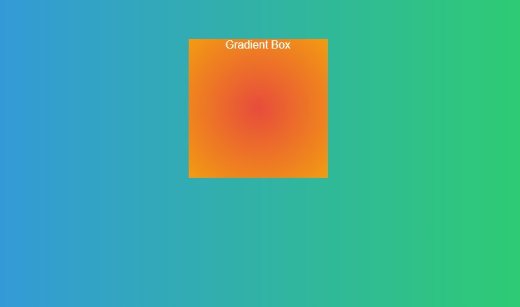
    2. Radial Gradient:

      • .box { background: radial-gradient(circle at 50% 50%, #e74c3c, #f39c12); }: Creates a radial gradient background transitioning between #e74c3c and #f39c12 in a circular shape centered at 50% 50%.
    3. Box Styles:

      • Styling for a box element with a width of 200px, height of 200px, and a radial gradient background.
      • margin: 50px auto;: Centers the box horizontally.

HTML

<!DOCTYPE html>
<html lang="en">
<head>
  <meta charset="UTF-8">
  <meta name="viewport" content="width=device-width, initial-scale=1.0">
  <style>
    body {
      font-family: 'Arial', sans-serif;
      margin: 0;
      padding: 20px;
      background: linear-gradient(to right, #3498db, #2ecc71);
      color: #fff;
      text-align: center;
    }

    .box {
      width: 200px;
      height: 200px;
      background: radial-gradient(circle at 50% 50%, #e74c3c, #f39c12);
      margin: 50px auto;
    }
  </style>
  <title>CSS Gradients Example</title>
</head>
<body>

  <div class="box">Gradient Box</div>

</body>
</html>

HTML

3.CSS media Queries :

Viewport Meta Tag:

<meta name="viewport" content="width=device-width, initial-scale=1.0">: Ensures that the webpage is scaled properly on various devices.

Base Styles:

Basic styling for the body, setting the font family, margin, padding, and text alignment.
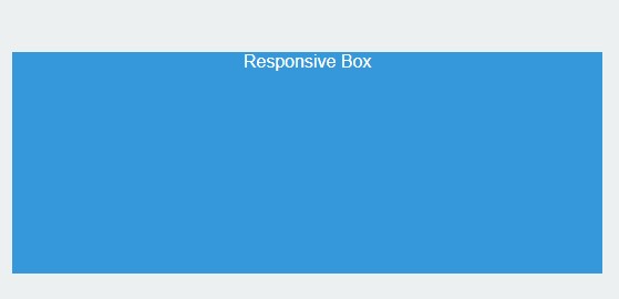
Box Styles:

Styling for a box element with a width of 200px, height of 200px, background color, text color, and centered margin.

Media Query:

@media only screen and (max-width: 600px) { ... }: This media query targets screens with a maximum width of 600 pixels.

Styles within the media query will only apply when the specified condition is met.

Responsive Styles:

Within the media query, background color of the body is changed to a light color (#ecf0f1).

The width of the box is set to 100%, making it responsive on smaller screens.

HTML

<!DOCTYPE html>
<html lang="en">
<head>
  <meta charset="UTF-8">
  <meta name="viewport" content="width=device-width, initial-scale=1.0">
  <style>
    body {
      font-family: 'Arial', sans-serif;
      margin: 0;
      padding: 20px;
      text-align: center;
    }

    .box {
      width: 200px;
      height: 200px;
      background-color: #3498db;
      color: #fff;
      margin: 50px auto;
    }

    /* Media Query for screens smaller than 600px */
    @media only screen and (max-width: 600px) {
      body {
        background-color: #ecf0f1;
      }

      .box {
        width: 100%;
      }
    }
  </style>
  <title>CSS Media Queries Example</title>
</head>
<body>

  <div class="box">Responsive Box</div>

</body>
</html>

HTML

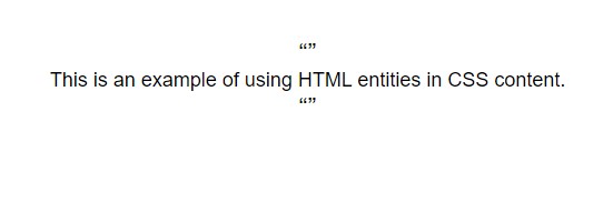
Adding HTML entities using CSS  :

The content property is used in the .quote::before and .quote::after pseudo-elements to insert left and right double quotation marks (\201C and \201D respectively).

The font-size property is used to adjust the size of the quotation marks.

The HTML content within the .text class includes two instances of the .quote class, which insert the left and right double quotation marks around the text.

HTML

<!DOCTYPE html>
<html lang="en">
<head>
  <meta charset="UTF-8">
  <meta name="viewport" content="width=device-width, initial-scale=1.0">
  <style>
    body {
      font-family: 'Arial', sans-serif;
      margin: 0;
      padding: 20px;
      text-align: center;
    }

    .quote::before {
      content: '\201C'; /* Left double quotation mark */
      font-size: 24px;
    }

    .quote::after {
      content: '\201D'; /* Right double quotation mark */
      font-size: 24px;
    }

    .text {
      font-size: 18px;
      margin: 20px 0;
    }
  </style>
  <title>HTML Entities in CSS Example</title>
</head>
<body>

  <div class="text">
    <div class="quote"></div>
    This is an example of using HTML entities in CSS content.
    <div class="quote"></div>
  </div>

</body>
</html>

HTML

Dear learners, Are you interested in assessing your progress?
Request your mentor to give you access and start your test.